
Sponsored Content Brought To You By Alure Home Improvements
It’s spring and it’s natural to want to color your world when outside the flowers are finally blooming, first the daffodils and then the forsythias. All of a sudden you see yellow where before there was nothing but drab, dull shades of muddy brown. You feel the surge and you want to take it back inside.
But then you find yourself getting overwhelmed by all the choices. There are more colors than tints on a rainbow. Before you know it, the weekend is over, and you’re still stuck with the same-old same-old in the rooms you wanted to change. Repainting indoors is easier done while the weather outside is still too rainy for a weekend project. You can open your windows to let out the paint fumes, but you don’t have to worry about your DIY plans being washed out by a sudden thunderstorm.
Here, we’ll encourage you to express yourself but do it reasonably. Remember that the colors you choose to repaint your room or refurnish your décor have to last for more than one season. They’ve got to have a relatively long life span unless you’re able to change your interior design on a whim, like a Hollywood star from the golden age of Technicolor. Smart people in the suburbs don’t have money to burn whenever their tastes change. We recommend you take the time to get it right.
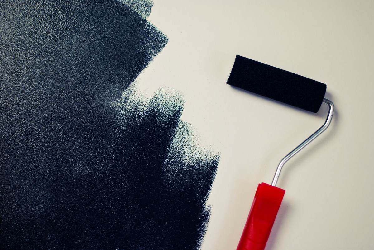
If you want to go bold, consider floral drapes in shades of pink or bring a touch of green into your room with a new picture frame or a painted chiffonier. We encourage you to step back and reflect. What’s the furniture look like? What’s the lighting? What’s the view outside the window? What’s the existing color scheme? You can use sample paint color boards to match what’s already there before you make your picks. All these things should be taken into consideration long before you open the paint can and pick up your brush or dip your roller.
You should be aware that the wrong paint color alters the appearance of someone who enters the room. Most common offenders are green and gray, especially if those are the colors on a bathroom wall behind you when you stand and look at yourself in the mirror. Warmer undertones are more conducive to a good impression. This concept works for a living room or a bedroom, too. Pink, peach and clear blue colors can definitely be flattering.
But remember: You don’t want to apply a color just because it matches your new sofa or your cabinets. You should pay attention to the neutral colors: beige, ivory, taupe, black, gray and white. Decorating with neutrals is never as easy as it looks on the surface because they have subtle undertones. A bad choice can still lead to an interior decorating disaster. Your friends at Alure Home Improvements don’t want that to happen to you. If you have any concerns, please consult us first.
Color experts say that a warm, neutral beige that trends toward taupe can enhance your indoor space while adding a stylistic touch that’s not too overstated. Warm beiges and taupe colors can work with cool color accents like blue but only if they’re free of gray, the experts say. An alternative is a gray beige combo, a pewter hue, which blurs the distinction between warm and cool. It’s a gray color warmed by soft brown undertones. But be forewarned because it can appear darker on the walls than its color swatch might lead you to believe. Diana Hathaway Timmons, a well-known color expert, said, “Its luminous quality makes it suitable for a variety of rooms. It looks its best with crisp white trim and dark woods.”
Learn More About Alure Home Improvements
Here’s another rule. There is no perfect white paint. That’s why it can be so difficult to choose the right shade. A white can have hints of gray, yellow or even pink. On the other hand, a warm white can be a perfect backdrop for warm colors in most cases, advise the experts. It can also go with cool colors if they’re saturated and not too gray. Improving overall color harmony and warmth is the goal.
What’s the furniture look like? What’s the lighting? What’s the view outside the window? What’s the existing color scheme?
Baby blue used to be very popular but the color trend for blues has apparently been shifting to slightly green and gray undertones. What blues you choose depends on several factors, like the lighting and the other surfaces in your home. You may want a blue that is rich with gray or a blue that is subtle with green. A good neutral blue can look great with dark or medium woods.
Another neutral color that has been drawing raves is an ethereal tan that has just enough warmth to banish the cold from a room but not so much that it heats up the space or clashes with the décor. The advantage of a neutral tan with a hint of beige in it is that it politely recedes into the background and lets your furnishings and décor speak for themselves. It pairs well with most woods and trims, and is compatible with a range of styles from Modern, to Mid-Century or French Provincial. A color called greige is a subtle blend of gray and beige that is neither too warm nor too cool. It’s inviting enough to be welcome in a room with all shades of wood from light to dark, and it is versatile enough to flow gracefully from room to room whether there are deep chocolate browns, black or deep gray with warm undertones as complementary colors. This hybrid also works well with yellow, orange and some other warmer colors.
The point is that you need to recognize the underlying tone that makes your neutral color either warm or cool and then go with it, depending on the feel you’re trying to achieve. But you don’t have to limit neutral colors to the broad surface of your walls. You can use them as accents, backdrops or even build an entire color scheme around them.
When you go for a spring fling, sometimes the less said the better.
And if you have more questions, come to Alure Home Improvements where our colorful characters won’t tell you anything off color.